The J-Card generator is too fun. Like, I want to make some mixtapes fun (yes, I have an unopened blank tape and a tape player). I even made my own J-Card (and related mix).
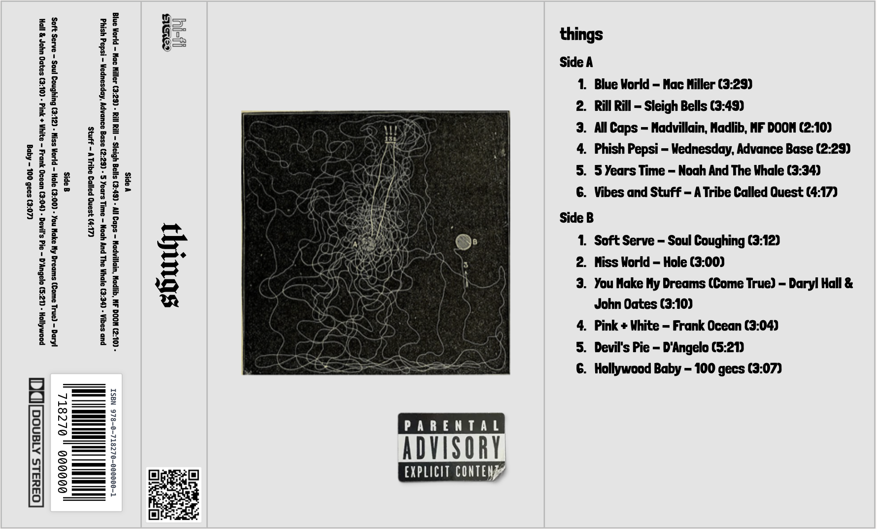
The J-Card generator is too fun. Like, I want to make some mixtapes fun (yes, I have an unopened blank tape and a tape player). I even made my own J-Card (and related mix).

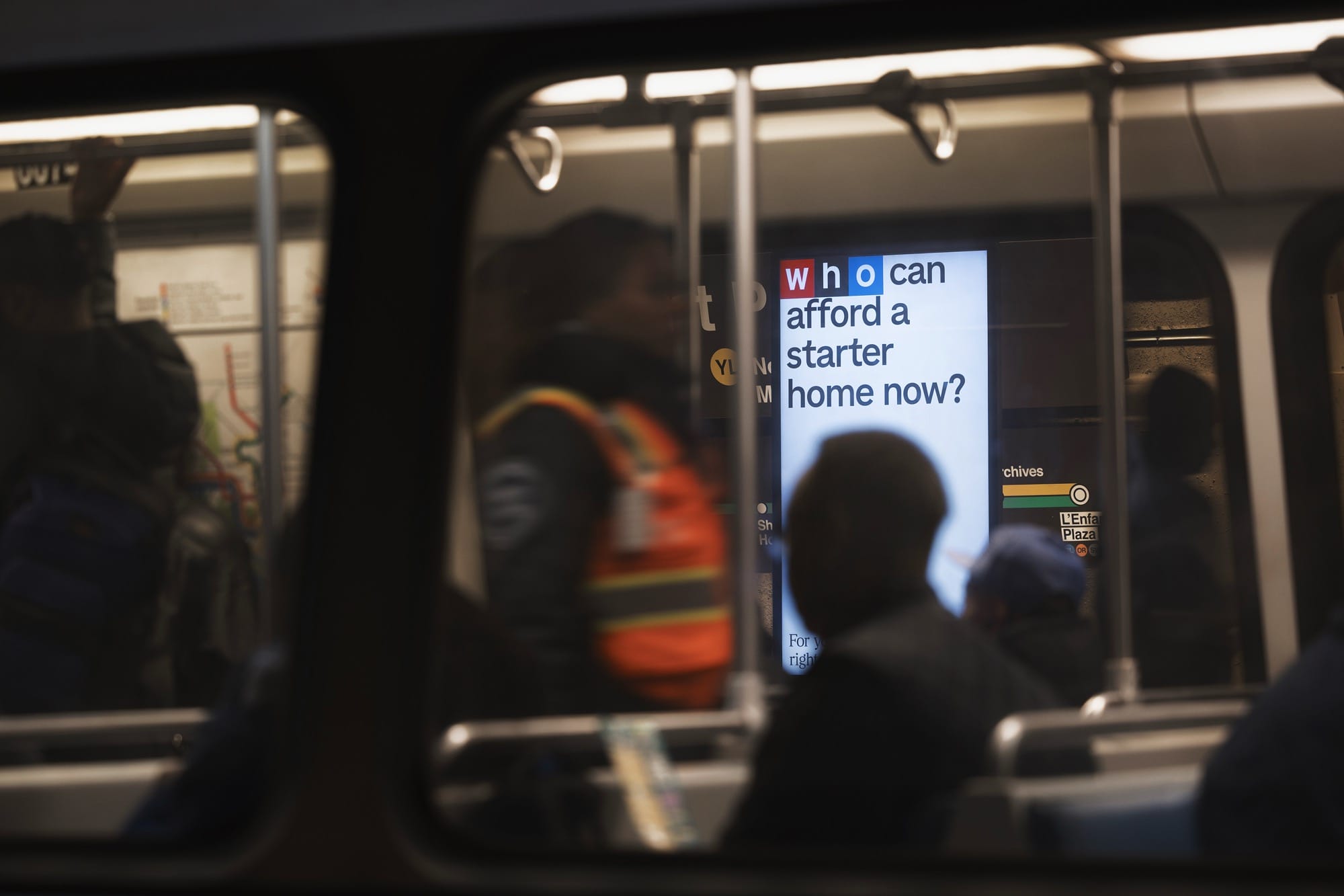
Mischief’s Genius Ads for NPR Provoke Urgent Questions About the Right to Information:
Across a range of formats, from merchandise and the sign on NPR’s headquarters to billboards and ad screens on the New York City subway, the recognizable block letters transform into urgent and timely questions—many that listeners around the country are asking. “How does AI affect my electric bill?” “Why are groceries still so expensive?” “How is my farm going to survive?”
Clever.
The Best Book Covers of the Last Decade. (lithub.com)
Radiant Computer. “We believe the current trajectory of personal computing is leading us to a less free world, and that only a new computing movement rooted in human dignity and creativity can change its course.” (radiant.computer)
Antic Bikes. I dig their brand and the bikes are pretty cool too. (anticbikes.com)
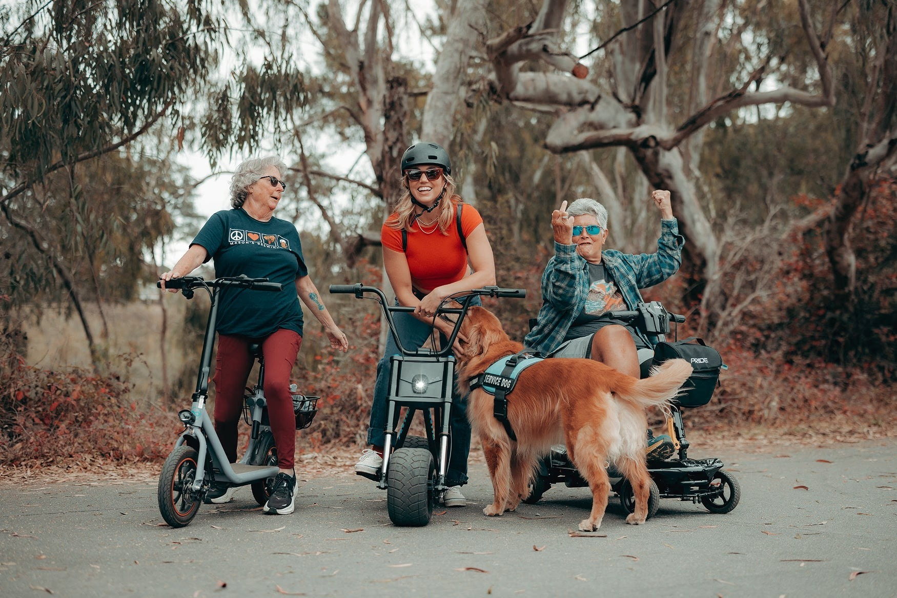
The Fundamentals Problem. “Anyone can make something that looks designed, but that doesn’t mean that design has happened.” (chrbutler.com)
Mangos. Manuals. Media.: librarians, heroes of the apocalypse.
Science Fiction Movie Lettering: “Glowing letters were a big trend that started in the late 80s, most likely set off by the Alien franchise. And I can never get enough of the 3D type in early films.” /via The Future is Like Pie
Examples of Good and Bad UX in Improvised Signage in Movie Theaters: answering is there an end or mid-credit scene?
Blackboard Bold: “a style of writing bold symbols on a blackboard by doubling certain strokes” /via SC 2.4.4
“There’s nothing at all wrong with honing in, developing your craft, making variations of things you’re good at, and getting better each time. Nothing small about it. Nothing unfulfilling about it.”
On Additive and Extractive Technologies, “an extractive technology seeks to extract value from you instead of providing it.” Avoid.
Seer, “the built environment itself is, for all intents and purposes, becoming a gigantic archive, at all scales, forensically recording every event that occurs within it, with few or no options for opting out.” Also, BLDGBLOG is still alive.
Google Fonts organized by vibe, even if fonts aren’t your thing, visit to see all the little cursors flying around the Figma canvas.
Alistair Smith’s personal site is pretty neat.
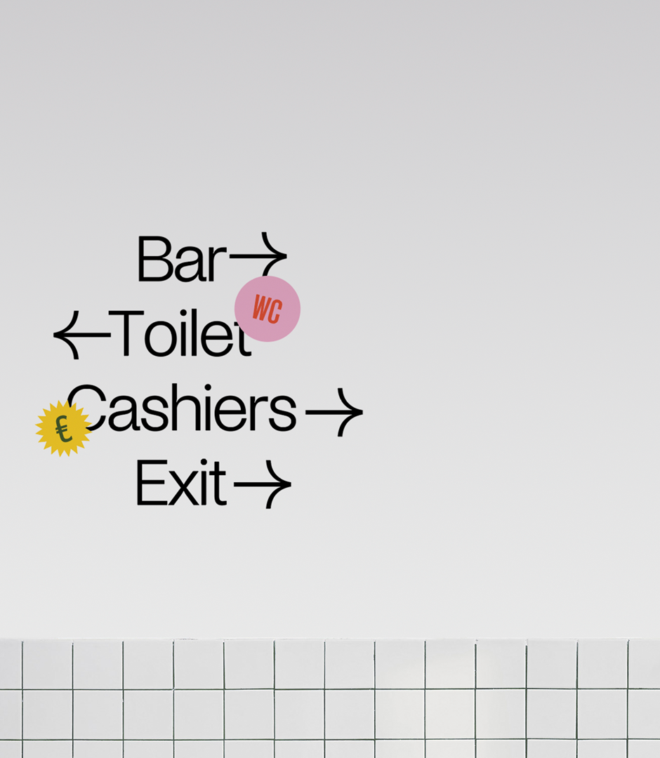
From Found Way, an amazing are.na collection of wayfinding, signs, etc.
Listen: Welcome to the Jam: The looney story of the decades-old ‘Space Jam’ website. A conversation with the team that built the site, also serves as a look at what making websites used to be like way back in the day.

Photo by Yama Bato.
You Can’t Post Your Way Out of Fascism: “Trusted information networks have existed since long before the internet and mass media. These networks are in every town and city, and at their core are real relationships between neighbors—not their online, parasocial simulacra.”
Simulacrum: “a representation or imitation of a person or thing.”
90’s Hip-Hop: A 45 plus minutes mix of Golden Era Classics + Rarities.
Makara Peak Mountain Bike Park Wayfinding: Cool signs.
Ghimli Sans: A font with “a nice ol' boozer vibe.”
Marginalia Search: “Find lost old websites.”
“every dashboard is a sunk cost / every dashboard is an answer to some long-forgotten question / every dashboard is an invitation to pattern-match the past instead of interrogate the present / every dashboard gives the illusion of correlation / every dashboard dampens your thinking”
How (and why) filmmakers like Wes Anderson and Christopher Nolan are using miniatures in their movies.
ui.land is a selection of websites, tools, engineers and designers to inspire, learn, and create. I can’t resist a good “list” site.
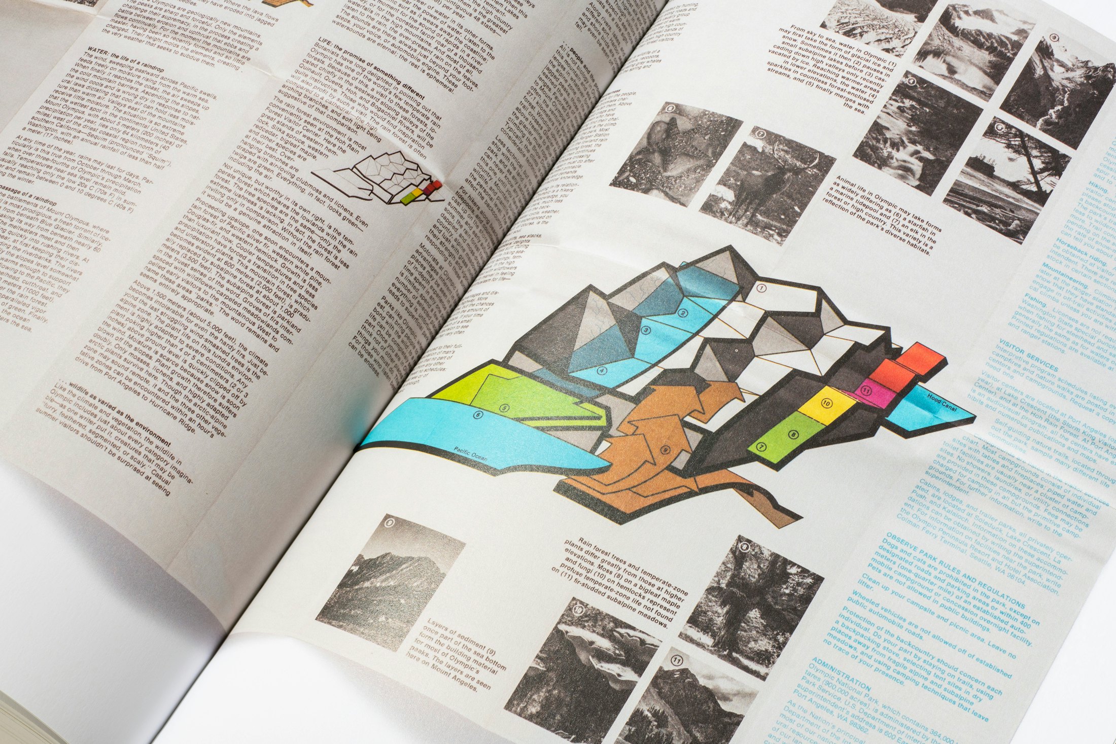
This map/diagram from the Parks book slaps. That is all.

“SUSA, the small conceptual electronic device can perform many of the functions of a smartphone, tablet or portable computer.” I’m dubious of all things AI, but the actual device is pretty neat. Shades of the Light Phone III.
Vintage Tech Logos is a collection of found vintage tech logos circa 1985.
There seems to be this kind of richness of the tactile experience that’s afforded by pushing buttons. They’re not perfect for every situation, but I think increasingly, we’re realizing the merit that the interface offers.
IKEA Catalog from a Near Future
Some design fiction on the " …possible evolutions of home life, consumer trends and needs, and related topics in the categories of domestic life, food, urban life, travel, leisure, and entertainment."
Not Built For This is a 6-part series from 99% Invisible. It explores how climate change is laying bare the vulnerabilities in the American built environment and how communities across the country have been left to bootstrap their own survival.
“I like to describe my job in terms of “The Door Problem”. Are there doors in your game? Can the player open them? Can the player open every door in the game? Or are some doors for decoration? How does the player know the difference?”
A resource for air travel designers, policy makers and enthusiasts, that describes the design of artifacts / spaces / systems that impact the passenger experience of air travel.
A sound kit for prototyping and play.