Listen: Welcome to the Jam: The looney story of the decades-old ‘Space Jam’ website. A conversation with the team that built the site, also serves as a look at what making websites used to be like way back in the day.
Posts in "design"
Some Things, Week 6, 2025

Photo by Yama Bato.
You Can’t Post Your Way Out of Fascism: “Trusted information networks have existed since long before the internet and mass media. These networks are in every town and city, and at their core are real relationships between neighbors—not their online, parasocial simulacra.”
Simulacrum: “a representation or imitation of a person or thing.”
90’s Hip-Hop: A 45 plus minutes mix of Golden Era Classics + Rarities.
Makara Peak Mountain Bike Park Wayfinding: Cool signs.
Ghimli Sans: A font with “a nice ol' boozer vibe.”
Marginalia Search: “Find lost old websites.”
Dashboards
“every dashboard is a sunk cost / every dashboard is an answer to some long-forgotten question / every dashboard is an invitation to pattern-match the past instead of interrogate the present / every dashboard gives the illusion of correlation / every dashboard dampens your thinking”
How (and why) filmmakers like Wes Anderson and Christopher Nolan are using miniatures in their movies.
ui.land is a selection of websites, tools, engineers and designers to inspire, learn, and create. I can’t resist a good “list” site.

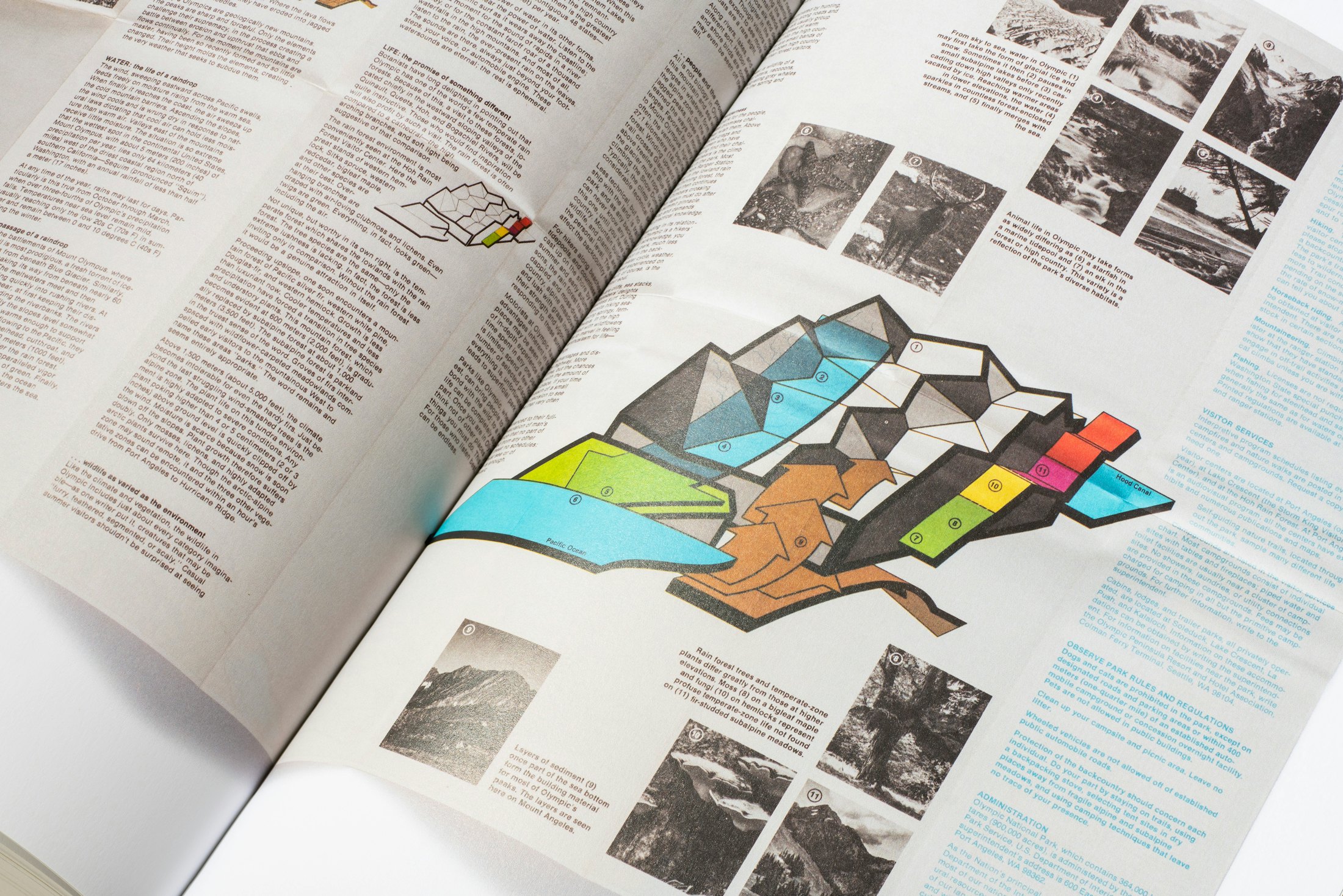
This map/diagram from the Parks book slaps. That is all.

“SUSA, the small conceptual electronic device can perform many of the functions of a smartphone, tablet or portable computer.” I’m dubious of all things AI, but the actual device is pretty neat. Shades of the Light Phone III.
Vintage Tech Logos is a collection of found vintage tech logos circa 1985.
There seems to be this kind of richness of the tactile experience that’s afforded by pushing buttons. They’re not perfect for every situation, but I think increasingly, we’re realizing the merit that the interface offers.
Links for Week 45, 2024
- An illustrated guide to science-backed mood boosters.
- A zine about reclaiming your life from digital technology.
- A tool for searching independent websites.
- A collection of the “best” marketing headlines on the internet.
- Over the Garden Wall’s 10th anniversary stop motion short.
- Max Vogel Gonzalez’s illustrations.
- An experiment with giving out potatoes to trick or treaters.
- A concept to break procrastination.
- Some objects I covet: Nike C1TY “Surplus” shoes, El Oso Bear Tee, the Kobo Clara Colour, and the book Assembling Tomorrow.