They talk about you, gurgling sugar through their roots …
Source: Root Words
They talk about you, gurgling sugar through their roots …
Source: Root Words
Effectively, the time costs of doing things over a weekend have diminished considerably for those who don’t have to commute.
For my flavor of UX and Design, I’ve found my most important work is communication. My role is to discover, gather, and analyze the many varied contributions and specifications from all of these contributors and generate output in a language that everyone understands. I also need my outputs to forward the conversation, and expand the audience, at each step.
A touchscreen, then, operates as a digital platform where features can be locked or unlocked by the company at will, depending on customers’ rent payments. Physical buttons, on the other hand, can’t be turned into rent. They only serve the customer, so they’re less attractive.
Source: Creative Good: Why car companies (still) ignore customers
Stack Rock Fort: Victorian island reclaimed by nature. The property has been bought by a community interest company, which plans to preserve it as a “living ruin”.
The quiet power of introverts. A nice animated short via the always great Converge Newsletter.
The “ghost hotel” nomenclature refers to an entire apartment building which is functionally a hotel because most or all units are short-term rentals instead of tenant-occupied.
Rad Reader by Alexander Cobleigh. “It’s like a pokedex for personal websites, and designed to surface the latest posts for you to view rather than juggle an ever-increasing inbox.”
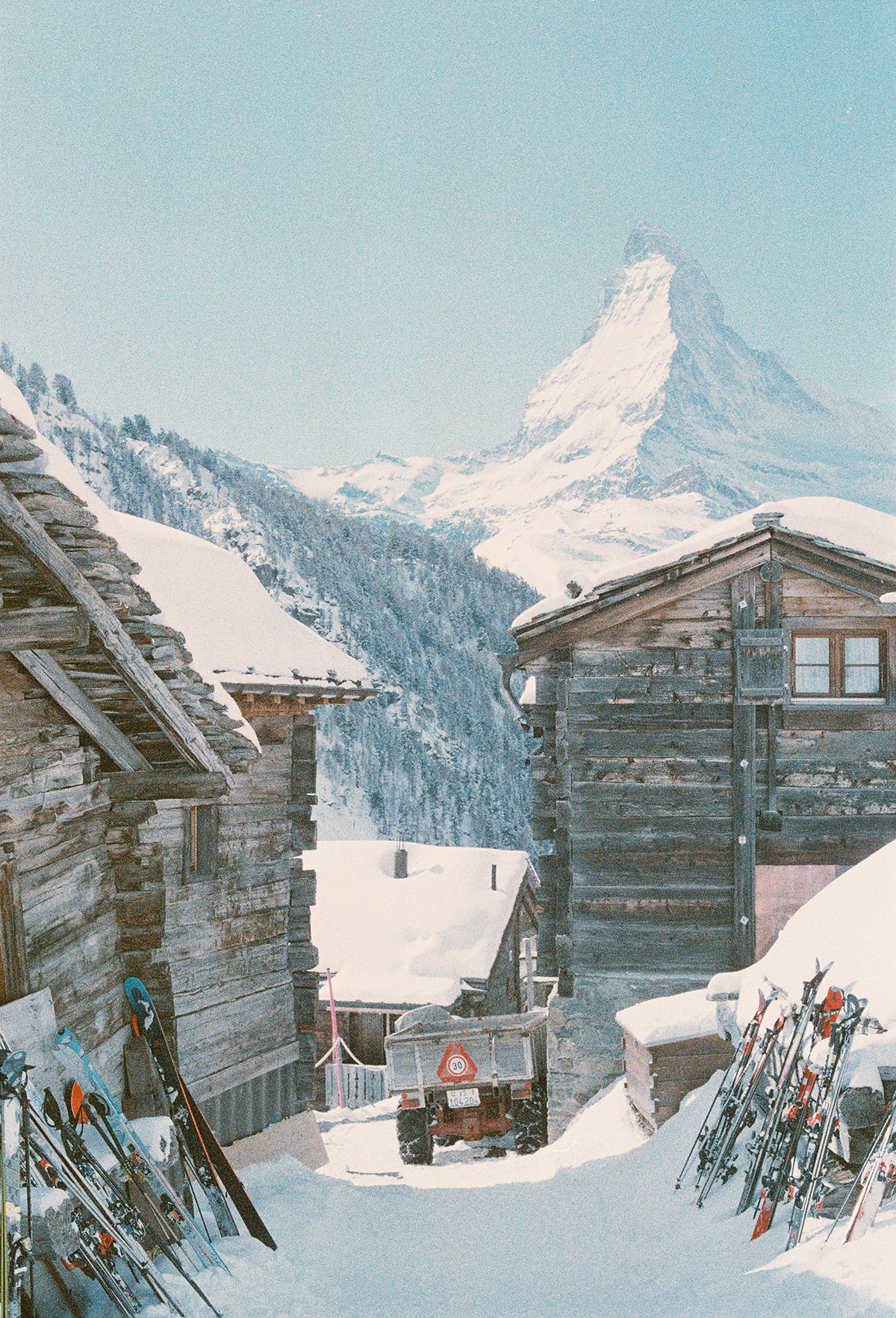
It’s really hot, let’s look at some classic cold photos. “Snow” by Photographers Arturo + Bamboo
Tools versus Systems. “Yes, the two are different.”